
Actual color may vary from on-screen representation.
It’s totally normal to feel nervous. Trying something new is always intimidating, but that fear shouldn’t stop you from making the most of your home. Start your DIY journey with “low-stakes” spaces like a closet or guest room. Those areas let you learn without pressure.
Jumping straight into a kitchen or living room project can pile on unnecessary stress, so build up your confidence first. Start small, grow your skills, and soon enough, picking up a paintbrush will feel second nature.
For me, maximalism is cozy. I feel most at home surrounded by my books, knickknacks, art, plants, and rooms painted wild colors. It might look chaotic to some, but it feels like a hug from my grandma who just baked a pound cake—there’s flour in your hair, but you know it’s all love. Minimal, white walls give “hospital” vibes, even when they’re beautifully designed. So, I don’t really balance maximalism with calm—I just design with what feels like me. A home without all my stuff wouldn’t feel cozy; it’d feel like a short-term rental you’d stay at on a work trip!
Honestly, I’ve used (or at least got samples of) just about every color I’ve ever wanted to use in a project! I love experimenting with bold and unexpected shades—reds, blacks, and muddy greens have all made appearances in my projects.
That said, I’ve been obsessed with International Klein Blue (IKB) lately. I just grabbed samples of Peek-A-Boo Blue 4007-10C, Strong Will 8001-44G, and Oh So Vo 8001-40G to test for an upcoming project. Stay tuned!
Paint—obviously! Painting used to be the ultimate rental taboo, but those days are gone. A fresh coat of color is the easiest, most affordable way to transform a space in a weekend. You can completely change the vibe of your home without breaking the bank or your lease.
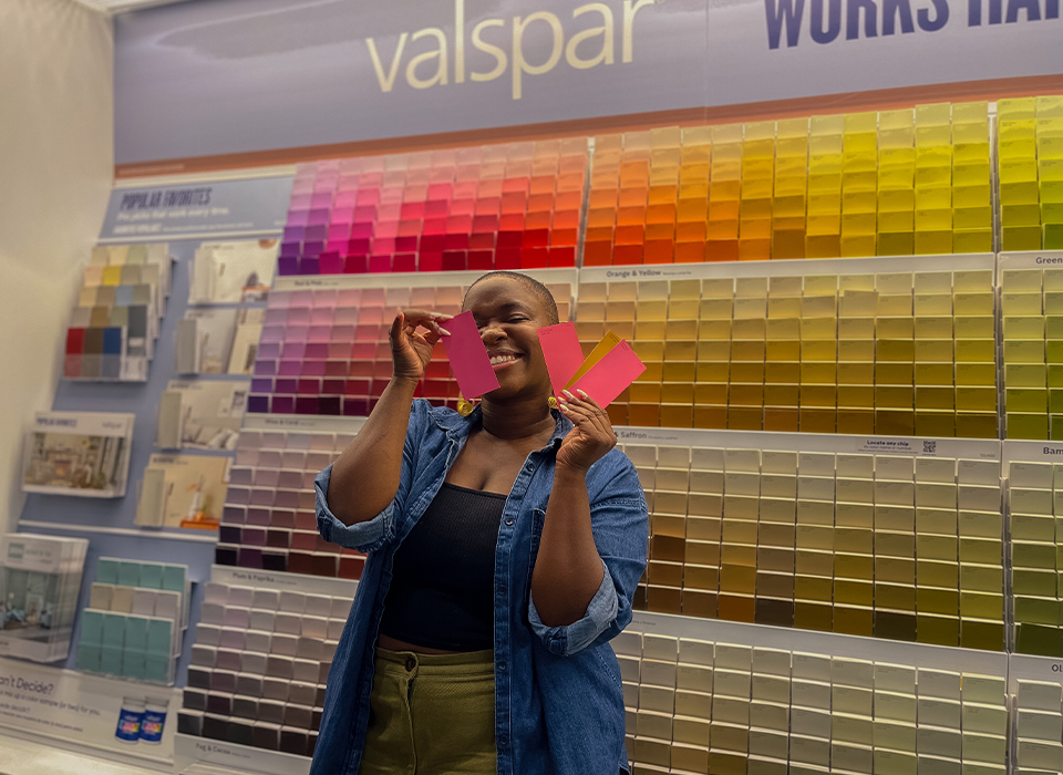
The moment I move into a new space I instantly start thinking about the paint combinations I can use to upgrade my space, and Valspar has been there for each and every insane-late night color decision I make for my rentals. All of the paint projects I’ve done over the years have helped bridge the gap between “this is a rented apartment” and “this is my home.”
I have a list:
- Lemon Cream 3006-4C: It’s a soft, buttery yellow that flatters every skin tone and design style—warm without being dated.
- Warm Eucalyptus 8004-28F: Valspar nailed it when they made this the 2026 Color of the Year. It’s a green that works like a neutral—calming, versatile, but never boring.
- PINK. It’s criminally underused! I’d love to see more people paint their living rooms pink. My top picks: Cosmic Pink 1001-1A, Very Berry 1002-1A, and Sugarplum Dance 1006-6A.
This one hits home! I have ten half-filled gallons and 40+ samples staring at me right now! If you’ve got kids (or nieces, nephews, or bored friends), hand them some scrap paper or cardboard and host a paint party.
Leftover samples are also perfect for smaller DIYs like picture frames, mirrors, candlesticks, or anything that needs a little color. And of course, always keep some leftover paint for touch-ups. You’ll thank yourself later.
1. Brush + mini roller = elite combo. Cut in with an angled brush, then soften the line with a mini roller. It blends perfectly once you roll the wall.
2. Clean your brushes and rollers right away. Some pro’s store them in the paint can overnight, but that gives me anxiety. Soap and water (or mineral spirits if needed) will keep your tools in great shape.
3. Invest in a good extension pole. Especially for ceilings—your back will thank you.
4. For smooth surfaces like melamine, use a foam roller. Always. You’ll get that factory-like finish every time.
Coconut Husk 8003-20G and Renew Blue 8003-37D from my bedroom makeover. I never would’ve chosen that blue if it weren’t the 2024 Color of the Year, but it turned out stunning. Years later, I’m still obsessed.
This feels like choosing a favorite child, but my most recent Valspar makeover for one of my followers, Dominique, takes the cake. I’ve always done projects for myself or very, very close friends, so taking on a client project felt like a big leap. We used Perennial 8001-25G, Cosmic Pink 1001-1A, and Lemon Cream 3006-4C—also a color combo that shouldn’t work, but somehow does. The space turned out beautiful, but more than that, it reminded me why I love what I do and the feeling of complete trust and belief from my clients was a real boost to my confidence.
After so many years of working on my own apartment, I’ve perfected my color selections and don’t want to add anything else to my home, so I started looking to others to see if I could help them get the same level of joy out of their homes that I do with mine and it working! So far, I’ve done a faux limewash makeover in my friend’s bathroom, a reading room refresh for my long-time boss using the 2026 Color of the Year, Warm Eucalyptus, and an entryway makeover for another friend using the 2025 Color of The Year, Encore. My partnership with Valspar has given me the confidence and opportunity to branch out and spread design joy!
Oh! I don’t think I should be given this much power, but I’ll take it! If I could, I’d create a line of metallic paints: a deep, moody blue, a rich copper, and a gold so shiny it makes Midas jealous. I'd name them Blue Bee-z, Plenty of Pennies, and Black Cleopatra!
I’d also like to expand the pink and orange offerings to create moodier versions of those colors. Imagine Frosty Berry or Bonfire Glow with a ‘lil bit more black in it—very moody, very pretty, very on brand for me. I’d call them Midnight Berry Blues and Glo’ by Night.