
Actual color may vary from on-screen representation.
It’s just paint…if you hate it, pick a new color and try again. It’s inexpensive and not at all permanent.
MY KITCHEN. It was one of the first projects I ever did and nearly 5 years later, I still love it. The kitchen is the heart of the home and it’s the room we all spend the most time in. Every morning when I wake up and go down to my kitchen and make a cup of coffee, I am happy.
It depends on the person. My kids love their rooms because each one has a space that feels authentic to their personality and style. I recently gave my daughter’s bedroom a glow up to reflect her tween years using two bright shades of purple, Lavender Escape 4002-7B and Positively Purple 4002-8B. Updating my daughter’s bedroom with Valspar felt really special because she is growing up fast and I wanted her space to reflect who she is right now. She was so excited to help pick out the colors, and seeing her reaction when the room came together meant everything to me. Partnering with Valspar on this project made the process feel easy and fun, and it gave her a room that truly feels like hers.
My wife would probably say either her office or our bedroom. Her office was designed with her input to be a space that she actually enjoys being in and that makes a huge difference since she primarily works from home and has to be in that room hours every day.
The usual places like movies, TV shows, AD house tours, Instagram and TikTok. But I also get a ton of inspo when I am out in the world living my life or traveling. There are tons of pictures on my phone of tile in restaurants, paint colors in bar bathrooms, floors in coffee shops, landscaping in the front of random houses, etc.
RED - I have been able to use a tiny bit of red here and there, but I would love to have red make a larger appearance in my designs. I just think it’s really cool, unexpected and bold. A few red shades I have been eyeing are Red Henna 1008-7A, Royal Garnet 1011-5, and Heirloom Red 1010-3.
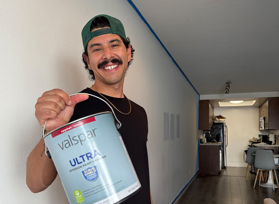
Honestly, working with Valspar this year has pushed me to try colors I may not have chosen in the past. Their range of shades and the quality of their paint has given me the confidence to take bigger risks and explore bolder, more creative ideas. I feel like my designs have grown because I have been exposed to so many new color possibilities.
I love to let my family provide input on the colors I pick for their spaces. I generally let my kids decide what COLOR they want for their room but then I am the one to pick the SHADE of that color. For example, a kid who wants a purple room will always choose the boldest, brightest purple imaginable. Instead, choose a few shades from the color wall that are actually nice and let them pick which one they like the most.
Also, when it comes to colors in your home - try to create a cohesive palette. You can have a home with a lot of different colors, but try to make sure they all work together well. For me, I like to choose warm versions of all the colors to create a warm and calming palette while still being fun and full of color and personality.
There are so many ways to use leftover paint! Mix colors together to create a new color for accent walls or small spaces. Paint furniture to make it look fresh and new – often times you need less than a gallon, so a leftover amount is usually perfect.
Play around with paint designs like stripes or checkers. Lastly, use it in a friend or family member's house! Buy a fresh gallon in the same sheen and use your leftover paint as the first coat then come back and do the second coat with the new paint!
I learned how to paint quickly and efficiently by watching other people paint, specifically professional painters. I watched painters I hired and paid close attention to HOW they were painting. The tools they used, the things they started with, the entire process. I learned that a good roller, and extender, and high-quality brushes make the process so much quicker and easier. There are also a ton of pro painters on social media, and they always have the best tips and tricks.
In my opinion - so many colors work well together as long as they are in a similar temperature palette. When I did my wife’s office, she wanted a multi-color checker design and its six different colors in a pattern. I simply chose six colors that were totally different but all “warm” and they work great together!
I love the 2026 Color of the Year, Warm Eucalyptus 8004-28F paired with Groundbreaking 8005-8F. I color drenched my home office in Warm Eucalyptus and then painted my desk in the color Groundbreaking. The two shades complement each other so well and make my home office a calming space that I can focus in.
"Fresh Start" – surprisingly, it would be the perfect warm neutral white. It would look great with most colors and be the ideal color to paint an entire home.
I think a lot of people need to take time with their designs and color choices. That means spending time in the rooms you are designing and really getting a feel for what you want, how you will use the space, and what you want it to look like. “Fresh Start” would be the ideal color to start with and build off of. The right white really looks great all the time and can feel completely finished while still leaving plenty of room to move forward with new colors as you work toward a complete and colorful home.