
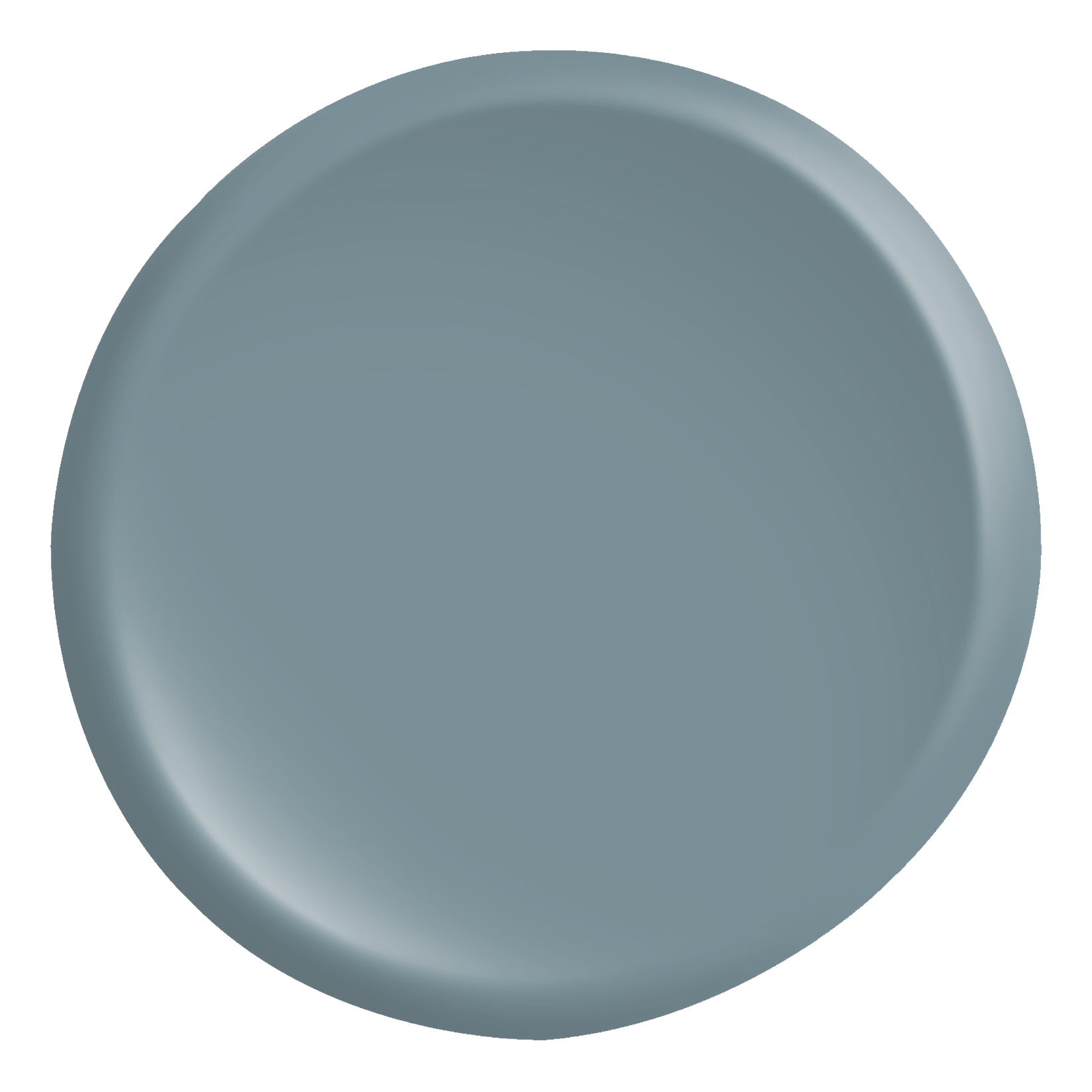
Actual color may vary from on-screen representation.
2027 COLOR OF THE YEAR
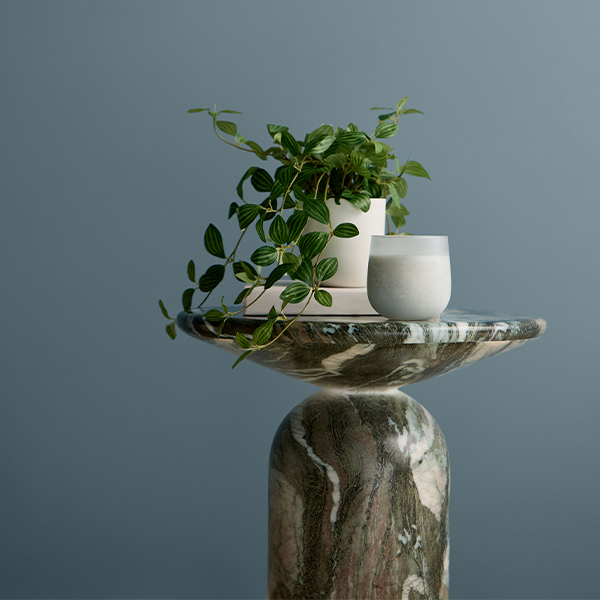
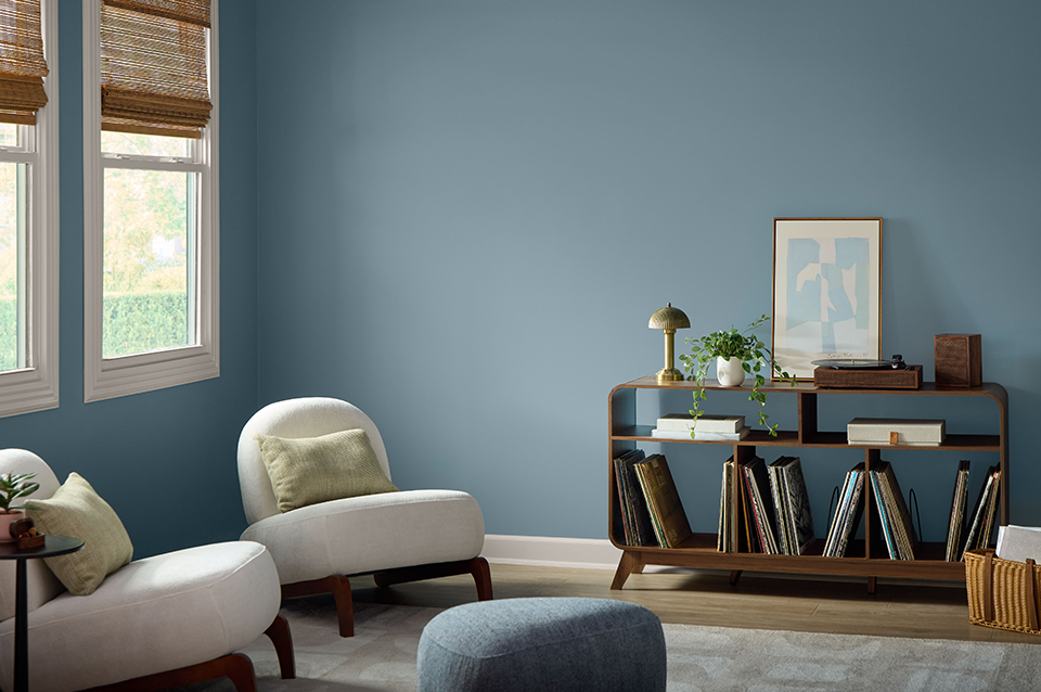
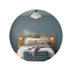
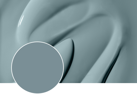
Experience a color that welcomes you home. Cottage Door, our 2027 Color of the Year, is a grayed-out blue hue, enriched with warm and inviting undertones. Find creative sparks for how to use this color in our tintable products to create moments of respite and reflection, inside and out.
WHY IT RESONATES
A cultural shift toward intentional living and self-reflection calls for authentic and heartfelt hues. Cottage Door answers with versatile, trans-seasonal color to inspire thoughtful and introspective spaces.
COORDINATING COLORS
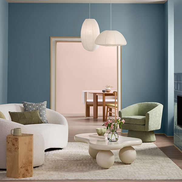
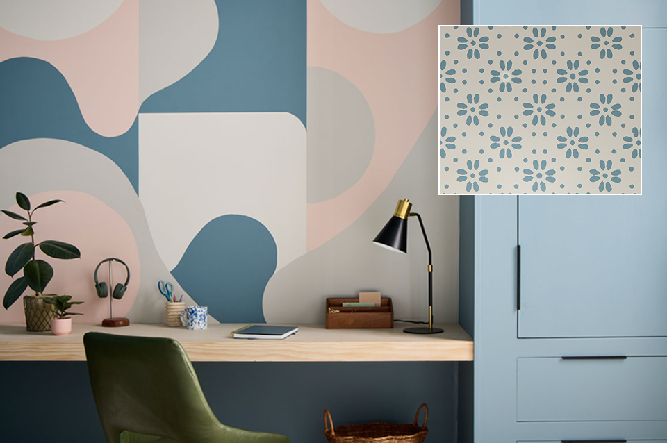
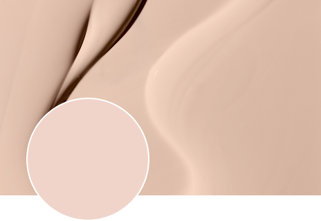
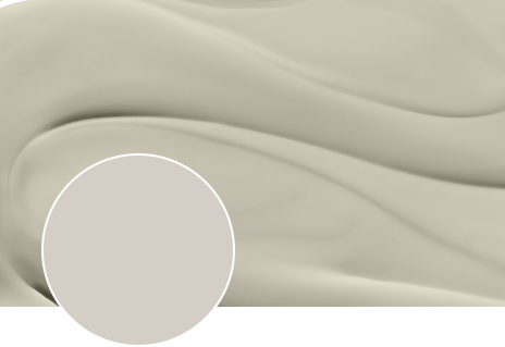
Balance Cottage Door with Apricot Blush and Moon Shot. Together, these subtle expressions of color deliver a gentle, uplifting spirit. Their soft, joyful tones infuse any space with warmth, optimism and comfort.
AESTHETIC DIRECTION
SOFT MINIMALISM
Soft Minimalism embraces the raw beauty of materials in their most natural state. It celebrates imperfection as a design strength rather than a flaw. The style evokes a sense of organic, natural calm rooted in a palette of muted blue-gray, soft blush and warm greige.
“Mid-tone blue-grays are being used to create spaces that feel both timeless and deeply personal – whether paired with joyful hues for contrast or layered with natural textures for a more organic feel.”
- Sue Kim, Valspar® Color Expert
COLOR PLAY
HOW TO USE
Celebrate patterns and craftsmanship. Play with the palette on a variety of surfaces and in a variety of products and sheens. Embrace textures and materials. Don’t just decorate. Create. Make an art piece or accent wall to showcase coordinating colors.
SPREAD THE LOVE
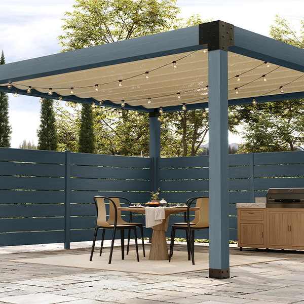
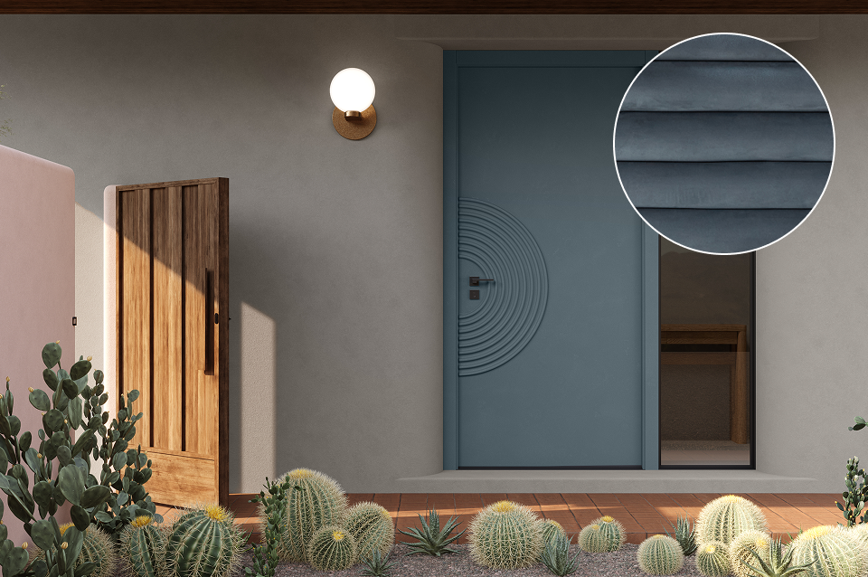
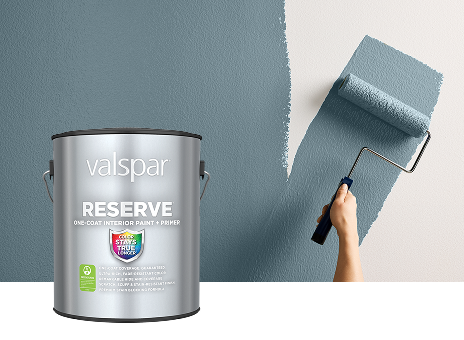
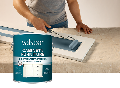
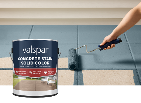
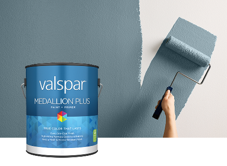
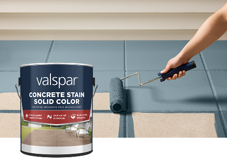
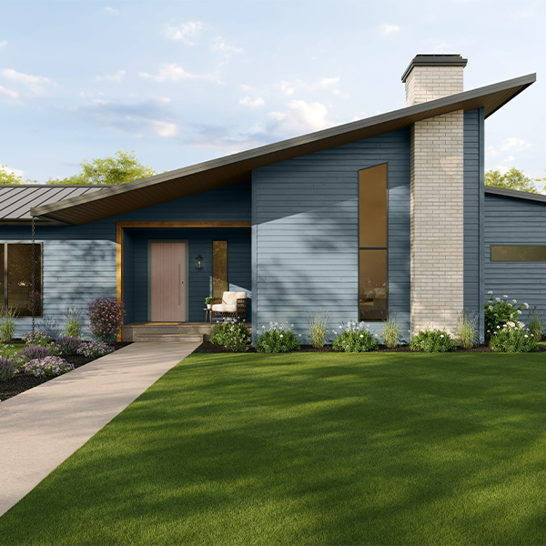
Share the Color of the Year and its coordinating colors everywhere. Tintable Valspar products make it easy to bring your vision to life. Roll, brush or spray Cottage Door on walls, doors, cabinets, furniture, concrete, wood and more.
2027 COLOR OF THE YEAR
Experience a color that welcomes you home. Cottage Door, our 2027 Color of the Year, is a grayed-out blue hue, enriched with warm and inviting undertones. Find creative sparks for how to use this color in our tintable products to create moments of respite and reflection inside and out.
WHY IT RESONATES
A cultural shift toward intentional living and self-reflection calls for authentic and heartfelt hues. Cottage Door answers with versatile, trans-seasonal color to inspire thoughtful and introspective spaces.
COORDINATING COLORS
Balance Cottage Door with Apricot Blush and Moon Shot. Together, these subtle expressions of color deliver a gentle, uplifting spirit. Their soft, joyful tones infuse any space with warmth, optimism and comfort.
AESTHETIC DIRECTION
SOFT MINIMALISM
Soft Minimalism embraces the raw beauty of materials in their most natural state. It celebrates imperfection as a design strength rather than a flaw. The style evokes a sense of organic, natural calm rooted in a palette of muted blue-gray, soft blush and warm greige.
“Mid-tone blue-grays are being used to create spaces that feel both timeless and deeply personal – whether paired with joyful hues for contrast or layered with natural textures for a more organic feel.”
- Sue Kim, Valspar® Color Expert
COLOR PLAY
HOW TO USE
Celebrate patterns and craftsmanship. Play with the palette on a variety of surfaces and in a variety of products and sheens. Embrace textures and materials. Don’t just decorate. Create. Make an art piece or accent wall to showcase coordinating colors.
SPREAD THE LOVE
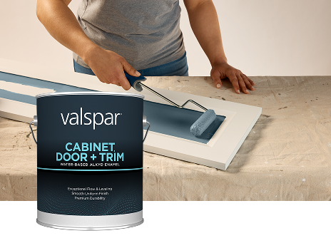
Share the Color of the Year and its coordinating colors everywhere. Tintable Valspar products make it easy to bring your vision to life. Roll, brush or spray Cottage Door on walls, doors, cabinets, trim, concrete, wood and more.
WHY IT’S TRENDING
Most of us are seeking an end to feeling overwhelmed – less stress, less information, less technology, fewer choices. Simplicity. Here, we can slow down and create the peaceful place we seek.